Last year, Forbes recognized Armenia among the Best Places To Travel, shedding light on a destination that has remained a well-kept secret until recently. Armenia’s absence from the spotlight stemmed from limited place branding efforts in the past, resulting in news reports of conflict and regional unrest. However, Armenia encompasses much more than its tumultuous headlines, and comprehensive brand awareness initiatives aim to redefine its image, enticing more travelers to explore its offerings. In 2022, Armenia’s Tourism Committee unveiled a country brand, encapsulated in the slogan “The Hidden Track.” While this branding approach may not resonate with everyone, it serves as the Committee’s flagship strategy to showcase Armenia’s unique identity. Yet, the question remains: Can a country brand alone suffice to establish robust place branding recognition? In this discourse, I’ll delve into the significance of public transport brands and their potential role in bolstering destination and place brand awareness, illustrating opportunities for Yerevan and Armenia.
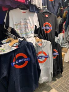
 Visitors and residents alike encounter a variety of keepsakes, souvenirs and decorative items featuring these brands, from logos to maps, reflecting the cities’ vibrant identities and telling the stories of its underground transport systems. These visuals often undergo trendy or humorous adaptations, remaining relevant to the times. Thus, donning a T-shirt adorned with the Underground logo signals an affinity for London, the city itself.
 Bringing it Home
For the past two decades, Armenia has been my home. I have lived, worked and created in Yerevan, one of the region’s oldest cities. Yerevan has its own metro system, comprising only ten stations across a 12 km stretch. Despite it being the smallest soviet-republic, the system, inaugurated in 1981, was the eighth metro system within the former Soviet Union.
As a strategic and creative communications professional, I see potential to enhance and integrate the Metro brand into Yerevan’s identity. The city’s metro stations, adorned with Armenian cultural motifs, are screaming branding initiatives. However, infrastructural upgrades, line expansions, and service enhancements are imperative to realize this vision.
Bringing it Home
For the past two decades, Armenia has been my home. I have lived, worked and created in Yerevan, one of the region’s oldest cities. Yerevan has its own metro system, comprising only ten stations across a 12 km stretch. Despite it being the smallest soviet-republic, the system, inaugurated in 1981, was the eighth metro system within the former Soviet Union.
As a strategic and creative communications professional, I see potential to enhance and integrate the Metro brand into Yerevan’s identity. The city’s metro stations, adorned with Armenian cultural motifs, are screaming branding initiatives. However, infrastructural upgrades, line expansions, and service enhancements are imperative to realize this vision.
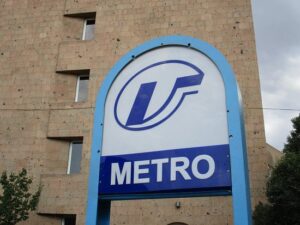 Several years ago, my team and I proposed a rebranding initiative for the Yerevan Metro, envisioning a modernized aesthetic and enhanced services aligned with contemporary business models. Regrettably, the proposal was met with skepticism by the administration at the time. Despite subsequent branding efforts, the metro system still awaits a comprehensive revamp.
As Yerevan continues its expansion, grappling with challenges like traffic congestion and the integration of eco-friendly transport alternatives, a cohesive vision, coupled with strategic branding, is paramount to shaping the identity of public transport and bolstering the city’s vibrant, forward-looking brand.
Several years ago, my team and I proposed a rebranding initiative for the Yerevan Metro, envisioning a modernized aesthetic and enhanced services aligned with contemporary business models. Regrettably, the proposal was met with skepticism by the administration at the time. Despite subsequent branding efforts, the metro system still awaits a comprehensive revamp.
As Yerevan continues its expansion, grappling with challenges like traffic congestion and the integration of eco-friendly transport alternatives, a cohesive vision, coupled with strategic branding, is paramount to shaping the identity of public transport and bolstering the city’s vibrant, forward-looking brand.
A Brand is So Much More Than a Logo!
How many times have you heard this phrase from branding or communications specialists? I’ve certainly encountered this misconception with at least 30-some clients in my 25-year career. Branding is the root of everything, and thus, I wish to discuss the journey of highly recognizable brands, specifically focusing on subway and metro systems, and how they have impacted their own city’s place branding efforts. Place branding means managing and promoting the image and identity of a specific location – a landmark, town or city, region or even country to attract visitors, businesses, and residents for growth and development. We’re all familiar with iconic cities like New York City, London, and Montreal, each renowned for their captivating destination branding efforts. In addition to the impressive branding efforts of these cities themselves, auxiliary brands associated with them have significantly contributed to their notoriety, elevating their recognizability and desirability. The London Underground, the NYC Subway, and the Montreal Metro have all played pivotal roles in branding their respective cities as easily navigable and accessible travel destinations.How Did It All Start?
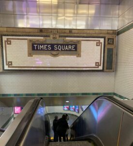
The New York Subway, officially launched in 1904, traces its origins back to 1870 when the first subway operated in a short 92-meter tunnel from Broadway to City Hall. It was powered by pneumatic energy. Today, it boasts 423 single stations, marking it also as one of the most utilized systems globally.
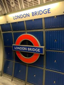
The London Underground, popularly known as the Tube, holds the distinction of being the oldest underground railway system in the world, starting operations in 1863. Spanning 402 km, it ranks as the world’s second-longest system.
Montreal’s Metro system inaugurated in 1966, uniquely designed to run entirely underground due to the city’s extreme winter conditions. Over time, Montreal developed the world’s largest underground complex around its Metro stations, covering 4 million sqm and serving half a million daily commuters.
Navigating the Subterranean Public Transport
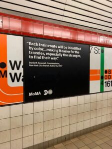
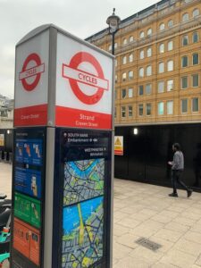
These complex subway systems encompass intricate networks of intertwined lines, incorporating train lines, major intersections, bus terminals, tramways, and more. Navigating these networks can be overwhelming for both visitors and residents alike, prompting the need for strategic planning and branding solutions. As time progressed and population increased, as the post-industrial and post war markets shifted to labor and urban-centered employment, the city had to move accordingly. In 1970, a more modern subway brand strategy and visual guidelines was developed by Massimo Vignelli to help the public get around. The brand’s primary focus was the subway map, simplifying it into a non-geographically accurate yet highly effective diagram using color codes, lines, simple dot symbols, and the sleek Helvetica typeface. This innovative approach transformed navigation, with subways commonly referred to by their lettered lines like “the Q” or “the C”. Traveling 600 km to the north, upon arriving in the vibrant city of Montreal known for its rich cultural heritage, diversity and European charm, the iconic blue and white Metro signs immediately catch the eye in the downtown area, symbolizing the efficiency and accessibility of Montreal’s public transportation system. Color psychology and mapping were also predominant for the user-friendliness of the public transport. Today, the Metro and its unique architecture play a pivotal role in Montreal’s identity, intertwining seamlessly with its extensive underground city infrastructure. Crossing the Atlantic to London, we encounter the Underground brand, which eventually expanded to encompass all public transport modes, even boats and bikes. The round logo with the word “Underground” encapsulated within a rectangular shape – reminiscent of a coffee shop logo – exudes a playful and trendy vibe, contributing to its enduring appeal.
Serving the Greater Purpose of Place Branding
How did these brands become integral parts of their local identities and find their place in place branding? What makes them desirable, even at first glance? What stories do they tell? Why are they top of mind? Having had the privilege of frequently visiting these cities and even residing in Montreal for decades, I’ve experienced firsthand the indispensable nature of public transport in daily life. However, I believe that while cities like Vienna and Barcelona boast well-operated public transport systems, they lack the engaging allure of those in Montreal, NYC, and London. So, what sets these brands apart? They’ve invested heavily in developing and crafting a winning brand strategy and promoting themselves on various fronts, from hosting international events like the Olympics to continuously innovating their image while offering a plethora of advantages in education, technology, culture, and fashion. These cities exude youthfulness, boasting unique architecture, rich history, and multicultural inclusivity. Most of all, they are portrayed to the world as places where people can feel free – to choose, work, live and be themselves. Often portrayed in films, their skylines or historic landmarks frequently feature prominently, with public transport omnipresent in these cinematic scenes.
Visitors and residents alike encounter a variety of keepsakes, souvenirs and decorative items featuring these brands, from logos to maps, reflecting the cities’ vibrant identities and telling the stories of its underground transport systems. These visuals often undergo trendy or humorous adaptations, remaining relevant to the times. Thus, donning a T-shirt adorned with the Underground logo signals an affinity for London, the city itself.
Bringing it Home
For the past two decades, Armenia has been my home. I have lived, worked and created in Yerevan, one of the region’s oldest cities. Yerevan has its own metro system, comprising only ten stations across a 12 km stretch. Despite it being the smallest soviet-republic, the system, inaugurated in 1981, was the eighth metro system within the former Soviet Union.
As a strategic and creative communications professional, I see potential to enhance and integrate the Metro brand into Yerevan’s identity. The city’s metro stations, adorned with Armenian cultural motifs, are screaming branding initiatives. However, infrastructural upgrades, line expansions, and service enhancements are imperative to realize this vision.
Several years ago, my team and I proposed a rebranding initiative for the Yerevan Metro, envisioning a modernized aesthetic and enhanced services aligned with contemporary business models. Regrettably, the proposal was met with skepticism by the administration at the time. Despite subsequent branding efforts, the metro system still awaits a comprehensive revamp.
As Yerevan continues its expansion, grappling with challenges like traffic congestion and the integration of eco-friendly transport alternatives, a cohesive vision, coupled with strategic branding, is paramount to shaping the identity of public transport and bolstering the city’s vibrant, forward-looking brand.
Raffi Niziblian is the Strategic & Creative Director of Deem Communications. He founded the agency in 2006 in Yerevan, where he resides with his family. Originally from Montreal, Canada, Raffi has held tenures in Europe, the Middle East and North America. He has worked on place branding such as the Open Gyumri Branding Project and the Karabakh Travel destination brand that was used for over a decade. You can read more about Raffi on his LinkedIn profile as well as DeeM website.
Raffi Niziblian


